Power BI offers a variety of map visuals, including Bing Maps, Filled Maps, and the newer Azure Maps, which is set to replace the first two. Additionally, there is the ArcGIS Map, a feature-rich option that provides advanced mapping capabilities such as demographic layers and spatial analysis. However, there are situations where you may need to define highly customized regions in your report.
Take Switzerland as an example. With its numerous cantons and municipalities, regional analytics are common. While Filled Maps or Azure Maps can mark different cantons, these visuals don’t support municipalities out of the box and require significant data preparation to avoid location misinterpretations (e.g., “Freiburg” exists in both Germany and Switzerland). Moreover, what if you want to define your own custom regions? This is a frequent need in Switzerland, where custom sales regions or language-based regions are often required.
An additional consideration with map visuals is that they often send data (in most cases only longitude and latitude, for the TomTom feature in Azure Map also the address) to a processing service, which may be located outside your country. This is worth noting, especially for organizations with strict data governance requirements. You can get more information in the official Power BI documentation.
The solution to all these challenges lies in Shape Maps. Unlike other map visuals, Shape Maps process data locally and do not send any data to external services. The setup is also relatively straightforward, if you’re in one of the fortunate countries supported by Microsofts default Shape Map options, as long as you don’t require much customization (you can check the list of supported countries here). Unfortunately, Switzerland isn’t on this list.
In this blog, I’ll guide you through:
- How to obtain a map of Switzerland in the correct format (TopoJSON).
- Preparing your data to align with the TopoJSON file.
- Setting up the Shape Map in Power BI.
Switzerland Map as TopoJSON
To use custom maps in Shape Maps, you’ll need a shape file in the TopoJSON format. This format encodes shapes as topological structures, using shared arcs and x-y coordinates to efficiently represent geographic boundaries with reduced redundancy.
If your map is available as a shapefile or GeoJSON, you can convert it to TopoJSON using tools like MyGeodata. For a map of Switzerland’s cantons and municipalities, the Swiss Map Generator is an excellent tool that saved me a lot of time by providing well-prepared TopoJSON files. If you need other groupings, such as tourism regions or metropolitan areas, you can find additional shape files provided by the Bundesamt für Statistik (BFS) here.
Using Swiss Map Generator:
- Select the Desired Layer:
On the Swiss Map Generator website, choose only the layer you want to display, such as cantons or municipalities. Keep in mind that the Shape Map visual in Power BI will always display the top hierarchy of your TopoJSON file. For example, if your TopoJSON includes both Switzerland and cantons, only the shape of Switzerland will be shown. - Export to TopoJSON:
After selecting the appropriate layer, use the export button to save your map in TopoJSON format.
Using shape files from BFS:
- Locate the correct subfolder
After downloading the shape files, use the provided PDF in the DOKU folder to identify the relevant files. - Convert to TopoJSON
Take only the files containing “Poly” from the folder, zip them, and upload them to MyGeodata to generate the required TopoJSON file. Make sure the output uses the coordinate system WGS 84. Download the TopoJSON file and rename the file extension from.topojsonto.json(Shape Maps only accept JSON as input).
Preparing data for Shape Map
When examining the exported TopoJSON file, you’ll see the polygon definitions for each shape on the map, along with the names of the polygon representations. For the Shape Map to function correctly, your data must use region names that match the polygon definitions exactly.
For cantons, it’s recommended to replace the names in the TopoJSON with their abbreviations to simplify mapping to different datasets. However, dealing with municipalities is more complex, as there are over 2,300 of them, and their boundaries often change over time due to splits or merges. How you proceed with mapping municipalities to your TopoJSON depends largely on your dataset.
In my case, I used a dataset from the BFS that provides KPIs such as population, area, the percentage of people receiving social assistance, political distribution, and more by municipality (you can find the dataset here). This dataset aligned well with the provided TopoJSON, while the BFS shape maps offered slightly better matches compared to the Swiss Map Generator. To map municipalities to cantons, I relied on a list of the current municipal status (Gemeindestand, available here) and used the municipality code for mapping.
If the municipality names in your dataset differ significantly from those in your TopoJSON, you will need to adjust either the TopoJSON or your data to match exactly. Alternatively, if your dataset includes municipality IDs (Gemeindecodes), you can programmatically extract the ID and name pairs from the TopoJSON file and use them as a mapping between the municipality names in your dataset and the shape map file. If you prefer to avoid this effort, you can use an official municipality list, following the same approach I used for mapping the cantons.
Creating the Shape Map in Power BI
Finally we are ready to create the Shape Map visual in Power BI. First of all, ensure that Shape Maps are activated. If you haven’t done so already, enable them under Preview Features in the Power BI settings.
Create Shape Map:
- Place the canton name or municipality name in the Location field.
- Add your KPI (e.g., population in my case) to the Color Saturation field.
- In the Format Panel, go to Map Settings and set the map type to Custom Map.
- Browse for your TopoJSON file under Add a Map Type and select it.
- Adjust the colors and set the minimum/maximum boundaries under Fill Colors to your liking.
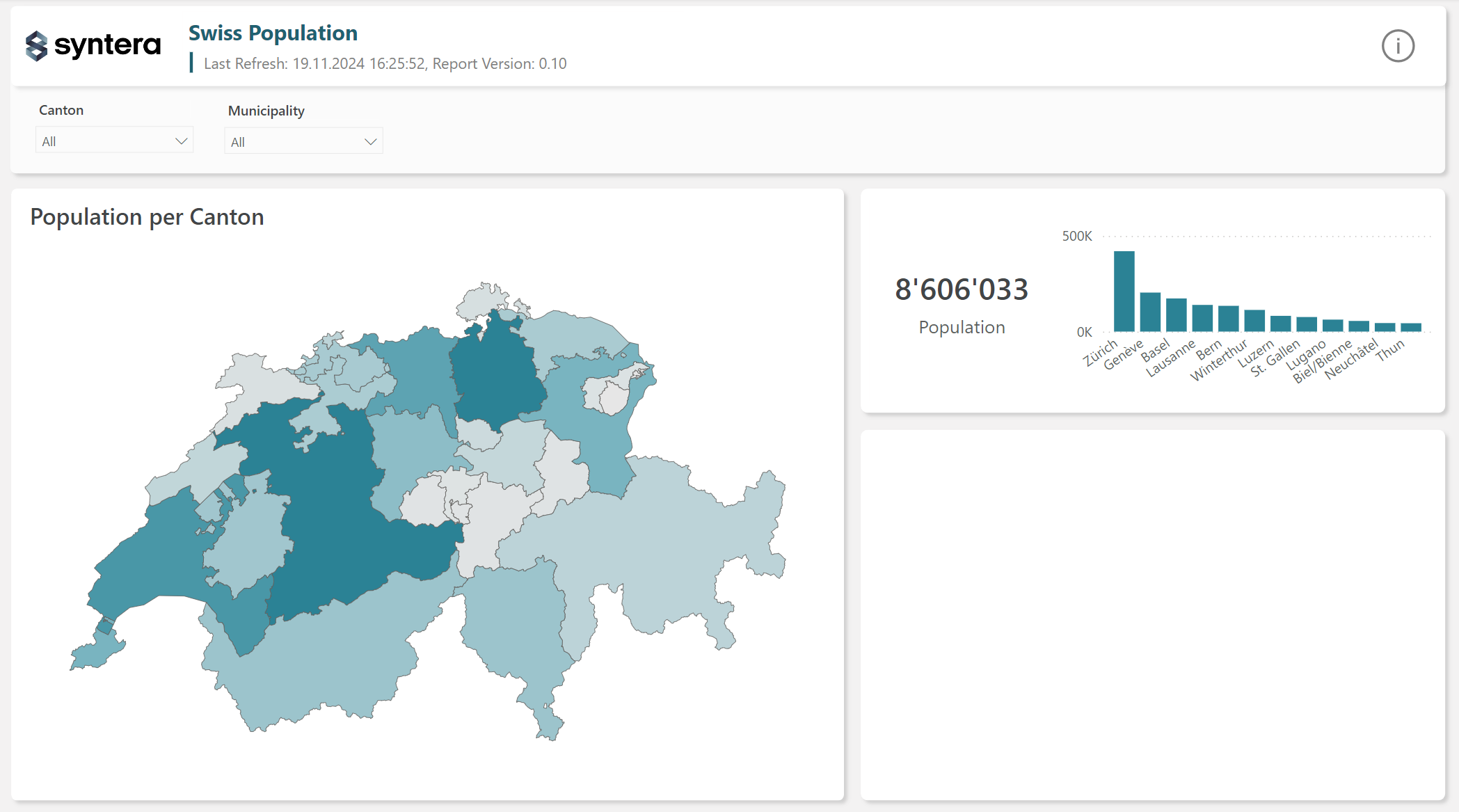
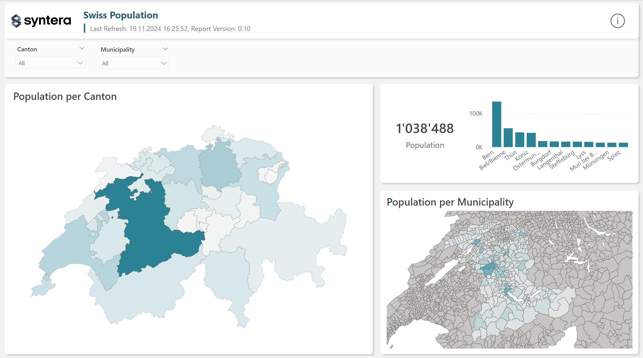
Your result should appear similar to the following:

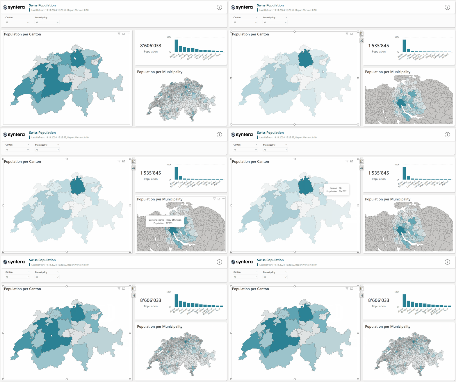
If you map canton and municipalities you can even cross filter the visuals and use a cool zoom animation. To do so repeate the steps from before but use the shape map of the municipalities this time. For the zoom animation enable Auto zoom under map settings for the map using the municiaplities shapes.

More about Power BI:

One response to “Power BI Shape Maps: Custom Switzerland Map”
[…] Power BI Shape Maps: Custom Switzerland Map – Syntera […]