In a recent project, a customer needed a report that provided an overview of the major projects within the company for the current and upcoming year. A Gantt chart is an ideal tool for displaying such data, offering both high-level and detailed views. Given that Power BI is widely regarded as one of the best, if not the best, reporting tools available, this should be a simple task, right? Unfortunately, Power BI does not have a native Gantt chart visual, and workarounds using other visuals often come with significant trade-offs, making them impractical.
While several custom visuals are available for creating Gantt charts in the Power BI marketplace, most come with aggressive pricing (monthly per-user fees), which is too costly for a larger company just beginning to transition reports to Power BI. The free alternatives are often limited, buggy, and lack full integration with Power BI’s interface and features. Furthermore, the free and paid options alike restrict the amount of additional data that can be added into the visual, which reduces their overall utility.
In summary, we couldn’t find a satisfactory, long-term solution. So, we decided to develop a custom approach. Although it requires a bit of effort to set up, you can create a fully customizable Gantt chart using a measure that ouputs the desired SVG, which Power BI can render. This method is robust, integrates seamlessly with existing Power BI visuals like matrices (retaining all Power BI functionalities), and allows you to customize the layout to your needs.
In this blog, we’ll provide you with a step-by-step guide to setting up this custom Gantt chart in your Power BI project.
Implementation

The solution consists of two parts:
- Setting up a timeline on the Gantt chart to enable the user to reference the Gantt bars to the respective month and year.
- Generating the Gantt bars and positioning them according to the timeline.
Let’s start by creating the Measure to generate the Gantt bars. Simply copy the code below and update the column names to align with your data model (Tip: You can quickly modify all occurances of a selected term by pressing Ctrl + Shift + L):
Gantt Bars =
-- Define dimensions
VAR _ColumnWidth = 450
VAR _RowHeight = 16

-- Calculate Minimum Date
VAR _MinDateGlobal = FIRSTDATE('Date'[Date])
VAR _MinDateConditional =
    IF(
        CALCULATE(MIN(Projects[StartDate]), ALLSELECTED(Projects)) > _MinDateGlobal,
        CALCULATE(MIN(Projects[StartDate]), ALLSELECTED(Projects)),
        _MinDateGlobal
    )

-- Calculate Project Durations and Scaling
VAR _MaxDuration =
    DATEDIFF(
        _MinDateConditional,
        CALCULATE(MAX(Projects[EndDate]), ALLSELECTED(Projects)),
        DAY
    )
VAR _ProjectDuration =
    DATEDIFF(
        MIN(Projects[StartDate]),
        MAX(Projects[EndDate]),
        DAY
    )

-- Calculate Bar Start Position
VAR _BarStart =
    DATEDIFF(_MinDateConditional, MIN(Projects[StartDate]), DAY)
    * DIVIDE(_ColumnWidth, _MaxDuration)
VAR _BarStartAdjusted =
    SWITCH(
        TRUE(),
        _BarStart < 4, 4,
        _BarStart > (_ColumnWidth - 6), (_ColumnWidth - 6),
        _BarStart
    )
VAR _TextStartAdjusted =
    IF(
        _BarStartAdjusted < (_ColumnWidth * 0.88),
        _BarStartAdjusted + 8,
        _BarStartAdjusted - 38
    )

-- Calculate Bar Width
VAR _BarWidth =
    _ProjectDuration * DIVIDE(_ColumnWidth, _MaxDuration)

-- Get Start Date
VAR _StartDate = FORMAT(MIN(Projects[StartDate]), "DD.MM.YY")

-- Calculate Today's Marker Position
VAR _TodayMarker =
    DATEDIFF(_MinDateConditional, TODAY(), DAY)
    * DIVIDE(_ColumnWidth, _MaxDuration)

-- Define Colors
VAR _ColourBarFill = "rgb(115,181,192)"
VAR _ColourBarStart = "rgb(22,131,150)"
VAR _ColourBarEnd = "rgb(22,131,150)"
VAR _ColourTodayMarker = "rgb(255,0,0)"
VAR _WidthTodayMarker = "1"

-- Generate SVG
VAR _SVG =
    "data:image/svg+xml;utf8,<svg width='" & _ColumnWidth & "' height='" & _RowHeight & "' xmlns='http://www.w3.org/2000/svg' xmlns:xlink='http://www.w3.org/1999/xlink'>" &
        "<rect x='" & _BarStart & "' y='4' width='" & _BarWidth & "' height='" & _RowHeight & "' fill='" & _ColourBarFill & "' stroke='rgb(255, 100, 30)' stroke-width='0.1' />" &
        "<polygon points='" & _BarStart & ",4 " & _BarStart + 4 & ",4 " & _BarStart + 4 & ",12 " & _BarStart & ",16 ' fill='" & _ColourBarStart & "' />" &
        "<polygon points='" & _BarStart + _BarWidth & ",4 " & _BarStart - 4 + _BarWidth & ",4 " & _BarStart - 4 + _BarWidth & ",12 " & _BarStart + _BarWidth & ",16 ' fill='" & _ColourBarEnd & "' />" &
        "<line x1='" & _TodayMarker & "' y1='0' x2='" & _TodayMarker & "' y2='16' style='stroke:" & _ColourTodayMarker & ";stroke-width:" & _WidthTodayMarker & "' />" &
    "</svg>"

-- Return SVG if Description is not blank
RETURN
IF(
    SELECTEDVALUE(Projects[Description]) = BLANK(),
    BLANK(),
    _SVG
)
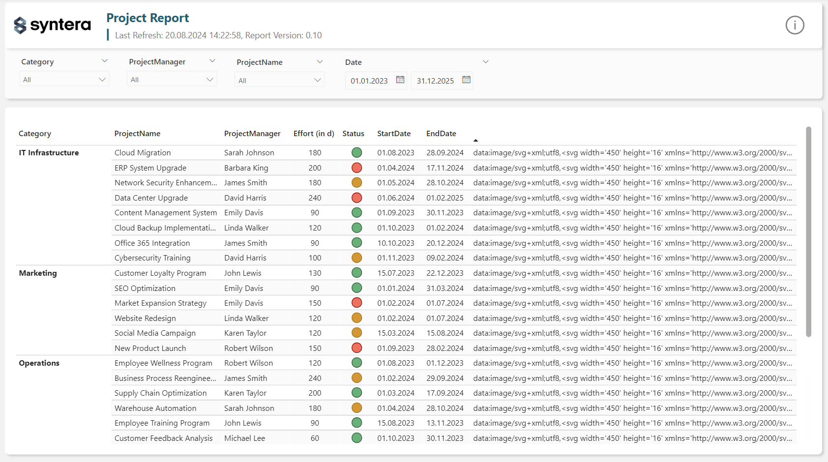
Insert the measure into your matrix, and you’ll notice the unformatted SVG code appearing as a result:

To ensure Power BI renders the SVG correctly, select your measure and set the Data category under Measure tools to Image URL.
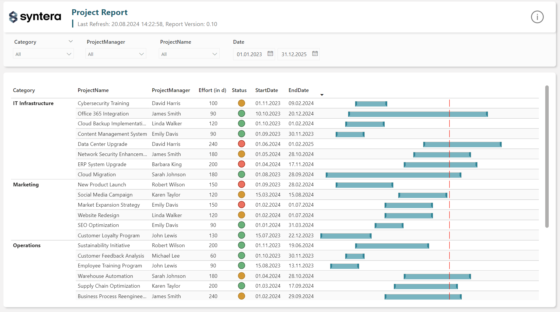
Depending on the available space in your matrix and the height of your rows, you may need to adjust the _ColumnWidth and _RowHeight variables. If the formatting looks off after these changes, it’s because the matrix is using an image size that doesn’t align with your intended dimensions. To correct this, select your visual, go to the Format tab, and scroll down to the Image size setting. Adjust the height and width to reflect the values you set in the Measure.
The outcome should look roughly like this:

You can change the look of the Gantt bars by changing the variables defined under — Define Colors in the measure. Once you are happy we can move forward with creating the measure to generate the SVG code for the timeline:
Gantt TimeLine =
-- Define dimensions
VAR _ColumnWidth = 450
VAR _RowHeight = 40

-- Calculate Minimum Date
VAR _MinDateGlobal = FIRSTDATE('Date'[Date])
VAR _MinDateConditional =
    CALCULATE(MIN(Projects[StartDate]), ALLSELECTED(Projects))
VAR _MinDate =
    IF(
        ISBLANK(_MinDateConditional) || _MinDateConditional <= _MinDateGlobal,
        _MinDateGlobal,
        _MinDateConditional
    )

-- Calculate Maximum Date
VAR _MaxDateFromData =
    CALCULATE(MAX(Projects[EndDate]), ALLSELECTED(Projects))
VAR _MaxDate =
    IF(
        ISBLANK(_MaxDateFromData),
        TODAY(),
        _MaxDateFromData
    )

-- Scaling and Markers
VAR _MaxDuration = DATEDIFF(_MinDate, _MaxDate, DAY)
VAR _Scaling = DIVIDE(_ColumnWidth, _MaxDuration)
VAR _TodayMarker = DATEDIFF(_MinDate, TODAY(), DAY) * _Scaling

-- Styling
VAR _FontSizeSmall = "8"
VAR _ColorTimeLine = "rgb(65, 58, 57)"
VAR _ColorTodayMarker = "rgb(255,0,0)"
VAR _WidthTodayMarker = "1"

-- Year Lines and Text
VAR _YearLines =
    CONCATENATEX(
        FILTER(
            ADDCOLUMNS(
                GENERATESERIES(_MinDate, _MaxDate, 1),
                "EndOfYear", IF([Value] = DATE(YEAR([Value]), 12, 31), [Value]),
                "PosYearLine", DATEDIFF(_MinDate, [Value], DAY) * _Scaling
            ),
            NOT(ISBLANK([EndOfYear]))
        ),
        "<line x1='" & [PosYearLine] & "' y1='0' x2='" & [PosYearLine] & "' y2='33' style='stroke:" & _ColorTimeLine & "; stroke-width:" & _WidthTodayMarker & "' />"
    )

VAR _YearText =
    CONCATENATEX(
        FILTER(
            ADDCOLUMNS(
                GENERATESERIES(_MinDate, _MaxDate, 1),
                "EndOfYear", IF([Value] = DATE(YEAR([Value]), 12, 31), [Value]),
                "PosYearLine", DATEDIFF(_MinDate, [Value], DAY) * _Scaling,
                "YearText", YEAR([Value]) + 1
            ),
            NOT(ISBLANK([EndOfYear]))
        ),
        "<text x='" & [PosYearLine] + 5 & "' y='13' font-family='Arial' font-size='10' fill='" & _ColorTimeLine & "'>" & [YearText] & "</text>"
    )
VAR _YearTextFinal =
    IF(
        NOT ISBLANK(_YearText),
        _YearText,
        "<text x='5' y='13' font-family='Arial' font-size='10' fill='" & _ColorTimeLine & "'>" & YEAR(_MinDate) & "</text>"
    )

-- Month Lines and Text
VAR _MonthLines =
    CONCATENATEX(
        FILTER(
            ADDCOLUMNS(
                GENERATESERIES(_MinDate, _MaxDate, 1),
                "EndOfMonth", IF([Value] = EOMONTH([Value], 0), [Value]),
                "PosMonthLine", DATEDIFF(_MinDate, [Value], DAY) * _Scaling
            ),
            NOT(ISBLANK([EndOfMonth]))
        ),
        "<line x1='" & [PosMonthLine] & "' y1='18' x2='" & [PosMonthLine] & "' y2='28' style='stroke:" & _ColorTimeLine & "; stroke-width:" & _WidthTodayMarker & "' />"
    )

VAR _MonthText =
    CONCATENATEX(
        ADDCOLUMNS(
            FILTER(
                ADDCOLUMNS(
                    GENERATESERIES(_MinDate, _MaxDate, 1),
                    "EndOfMonth", IF([Value] = EOMONTH([Value], 0), [Value]),
                    "PosMonthLine", DATEDIFF(_MinDate, [Value], DAY) * _Scaling,
                    "PosNextMonthLine", DATEDIFF(_MinDate, EOMONTH([Value], 1), DAY) * _Scaling,
                    "MonthText", LEFT(FORMAT(EOMONTH([Value], 1), "mmm"), 1)
                ),
                NOT(ISBLANK([EndOfMonth]))
            ),
            "Gap", [PosNextMonthLine] - [PosMonthLine]
        ),
        "<text x='" & ([PosMonthLine] + DIVIDE([Gap], 2)) & "' y='26' text-anchor='middle' font-family='Arial' font-size='" & _FontSizeSmall & "' fill='" & _ColorTimeLine & "'>" & [MonthText] & "</text>"
    )

-- Final SVG Construction
VAR _SVG =
    "data:image/svg+xml;utf8,<svg width='" & _ColumnWidth & "' height='" & _RowHeight & "' xmlns='http://www.w3.org/2000/svg' xmlns:xlink='http://www.w3.org/1999/xlink'>" &
        _YearLines & _YearTextFinal & _MonthLines & _MonthText &
        "<line x1='0' y1='18' x2='512' y2='18' style='stroke:" & _ColorTimeLine & ";stroke-width:" & _WidthTodayMarker & "' />" &
        "<line x1='" & _TodayMarker & "' y1='0' x2='" & _TodayMarker & "' y2='39' style='stroke:" & _ColorTodayMarker & ";stroke-width:" & _WidthTodayMarker & "' />" &
        "<rect x='0' y='16' width='2' height='5' fill='rgb(144,142,142)' />" &
    "</svg>"

RETURN _SVG
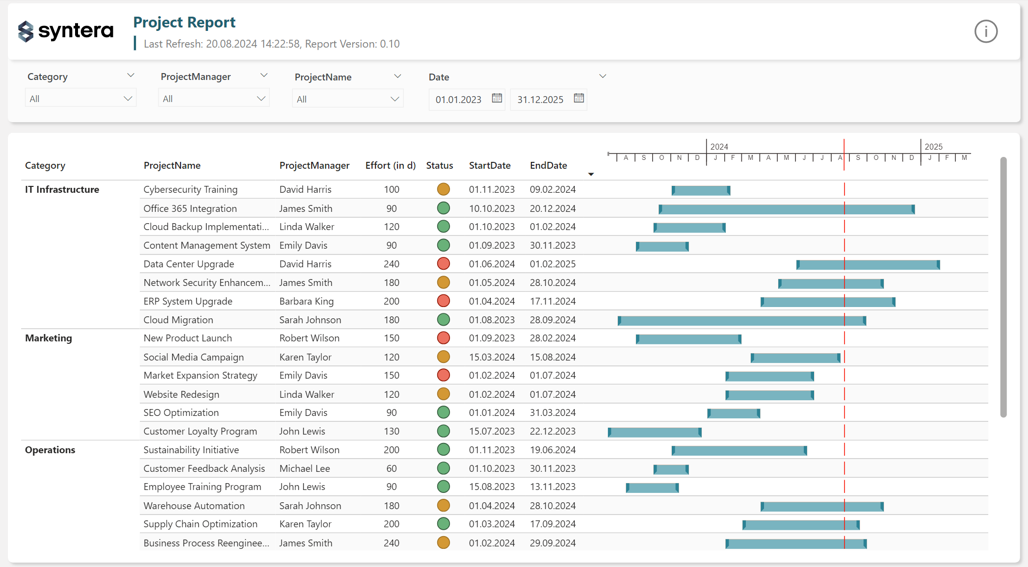
Set the Data category to Image URL as we did with the Gantt bars measure. Add a matrix visual to your report and add the measure to the Values field. Remember to adjust the image’s height and width under the Image size setting in the Format tab. Next, carefully resize the matrix and position it over your Gantt bars matrix. Use the red line marking today’s date to align the timeline. The resulting Gantt chart should look roughly like this:

More about Power BI:
3 responses to “Building native Gantt Charts in Power BI”
[…] Building Gantt Charts with Power BI – Syntera […]
[…] Building Gantt Charts with Power BI – Syntera […]
[…] Building Gantt Charts with Power BI – Syntera […]