Welcome to my blog on how to create dynamic axes for visuals in Power BI using field parameters. If you’re familiar with creating visuals in Power BI, you may have come across the challenge of displaying data over time in a way that remains visually appealing and informative when the time period under consideration changes.
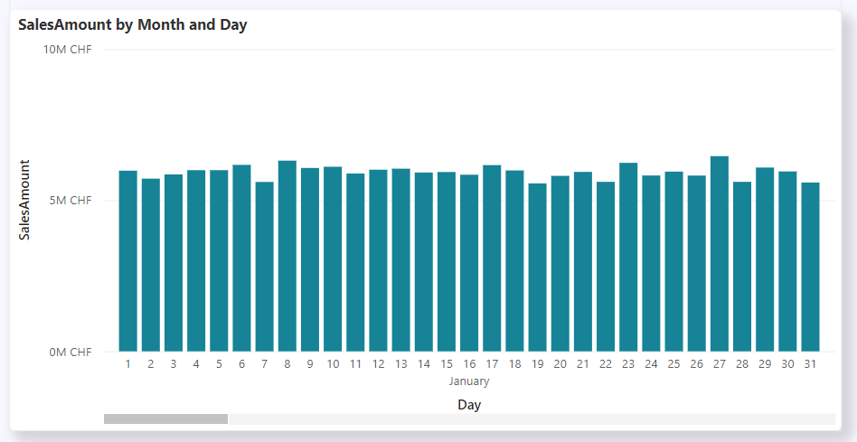
Lets say we create a report that visualizes the sales amount of the current year. In the first few months of the year we would like to see the data on a daily basis and use the space in the chart to display as much information as possible. But as time goes on our dataset expands and encompasses more and more days whereas the granularity of daily intervals can become overwhelming and does not fit in our chart anymore without scroling (picture below shows the same chart in the beginning and the middle of the year). The resulting chart can become cluttered and difficult to interpret, making it desirable to switch to a weekly or monthly basis to maintain clarity and readability but we don’t want to increase the effort of maintenance for our reports. That leaves us with a tradoff, where the choosen granularity is either not optimal in the beginning or the ending of the year. This challenge gets even worse with reports that includes multiple years of data.

In this blog, we will explore a practical solution to this problem. By utilizing field parameters in Power BI together with a helper table we can dynamically adjust the time period on the axis based on the number of days in our dataset. This means that the visual representation of our data will adapt automatically, transitioning to a more suitable granularity as your dataset evolves.
Short summary of the solution
- Create a field parameter
- Add all desired time granularities to the field parameter
- Create a helper table which contains all dates of your dataset and the desired granularity in a second column
- Create relationship between date table and the helper table
- Create relationship between the helper table and the field parameter
- Insert Field Parameter in the axis of your visual
- Top N filter on visual using the column of the helper table
Create a Field Parameter
- In the Report View under Modeling go to New Parameters and click Field Parameters
- Add all desired time granularities to the field parameter (in my case day, month, quarter and year)

Create a Helper Table
- In the Data View under Table Tools select New Table
- Enter the following Dax Code and adjust the month thresholds to your according to your requirements
DateToPeriod =
ADDCOLUMNS(
    CALENDARAUTO(),
    "Period",
    VAR CountMonths = DATEDIFF(MIN('Calendar'[Date]), [Date], MONTH)
    RETURN
    SWITCH(
        TRUE,
        CountMonths = 0, 0, -- If 0 Months use Day
        CountMonths <= 3, 1, -- If 3 Months or more use Month
        CountMonths <= 36, 2, -- If 36 Months or more use Quarter
        3 -- Else use Year
    )
)
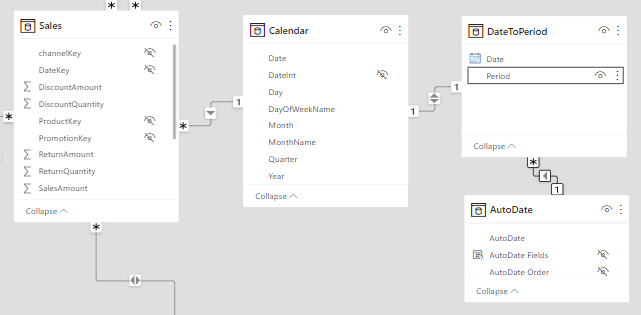
This creates a table with one column for each date in your date table and a second column “Period” with the granularity that should be used, returning 0 for days, 1 for months, 2 for quarters or 3 for years. The column “Period” is later used to establish the relationship between the helper table and the AutoDate table which was created by setting up the field parameter.
Create Relationships in Datamodel
- In the Model View select Manage Relationships and create a new relationship
- Select the Date column in your Date tabel and the Date column in your helper table and create the relationship
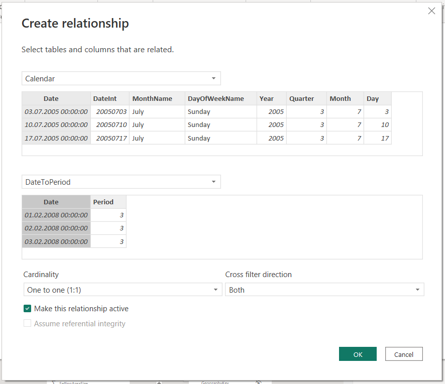
- Create another relationship between the helper table and the field parameter table using the “Period” column of the helper table
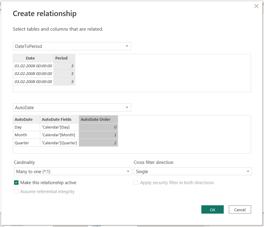
With the established relationships the datamodel looks like this:
Add Field Parameter to Visual
- Go to your visual and add the field parameter to the axis of your visual
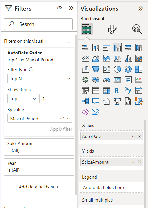
- Add the field parameter order (in my case “AutoDate Order”) to Filter on this Visual
- Change the filter to a TopN filter and insert 1 in the Show Items field
- In the By Value field for the filter select the “Period” column of the DateToPeriod table and switch the aggregation from count to max
